Designing a geospatial tool to explore microscopic data in developing nations
Overview
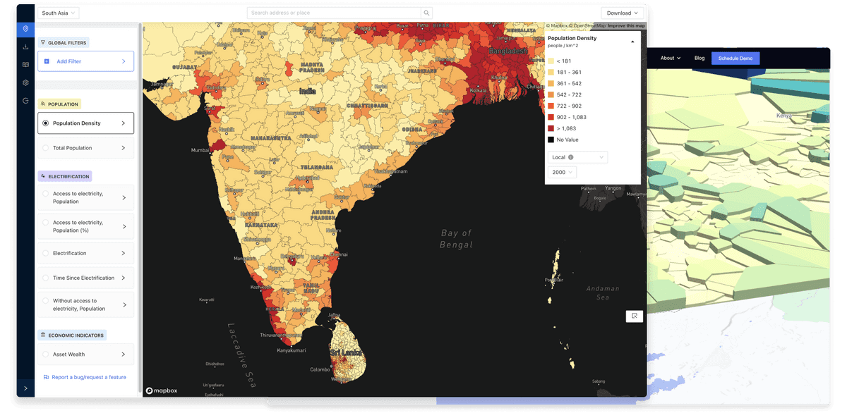
Aperture™ research is the first web-based product that lets customers explore Atlas AI’s socioeconomic, demographic, infrastructure, and agricultural yield data across Africa and South East Asia. The web-based tool allows academic & institutional researchers to visualize & filter data to explore areas of interest.
My role
User & technology research, lead designer & prototyper (2020 - Present)
Collaborators:
Deven Desai(Product), Jeff Bishop, Amit Sen, Jacob Chapman, Ginger Balmat(Engineering)
Context
Atlas AI uses ML & statistical models to generate data & insights at a microscopic level in developing nations where a lack of essential data can hinder decisions. Decisions like: "Where do people need the most electrification infrastructure support?" The task ahead was to make this cornucopia of data accessible to other researchers & institutions.
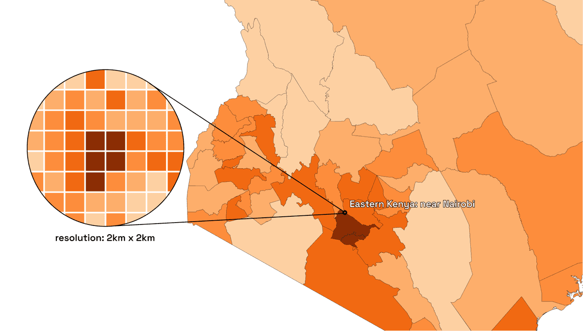
With the data available from a country to a continuous 2km x 2km grid resolution on a continental scale, visualizing & presenting was a challenge. Geospatial tools have historically assumed expertise.
Goal
Our goal was to make a simple platform accessible to researchers & organizations so that they could explore & understand on ground socioeconomic conditions.
1. Understanding
Visualizing: Data
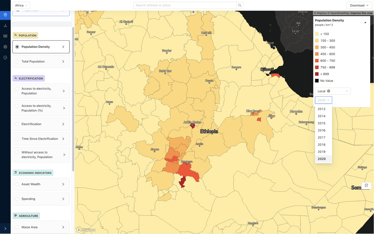
Our first goal was to present the data so a user could understand “How a variable varied across a geographical area.” Since our data had no geographical gaps, choropleths were a natural answer to represent most of our data.
User research highlighted key insights on traditional geospatial products:
- Layering: Data layers are overlaid on top of each other in varying z-indices with options to turn them on/off & change the opacity. Making multiple layers visible with varying opacities was detrimental to understanding data.
- Adding data: To avoid loading massive datasets, users need to select a dataset to visualize by searching through a massive catalog which was daunting for them as the initial action.
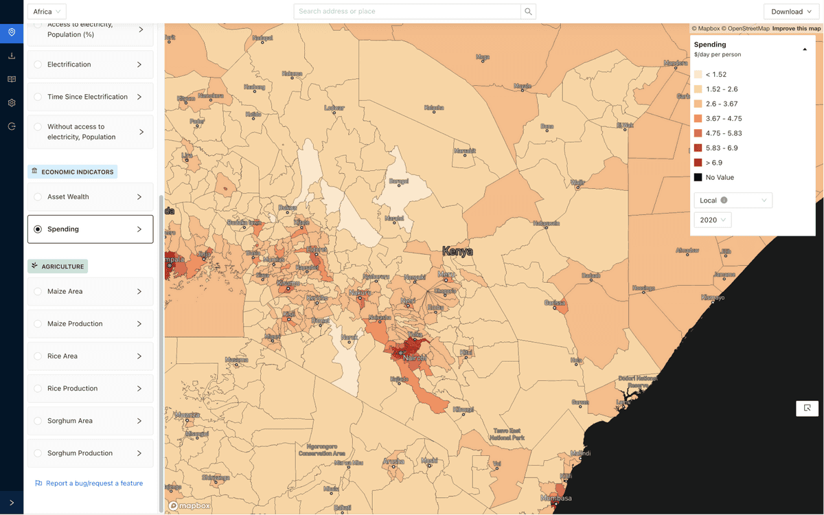
We chose to simplify this by limiting their options to visualize only a single layer at a time(radio over checkbox). In addition, the dataset names show up as layers that are fetched on selection, reducing the initial step.
Visualizing: Time & Space
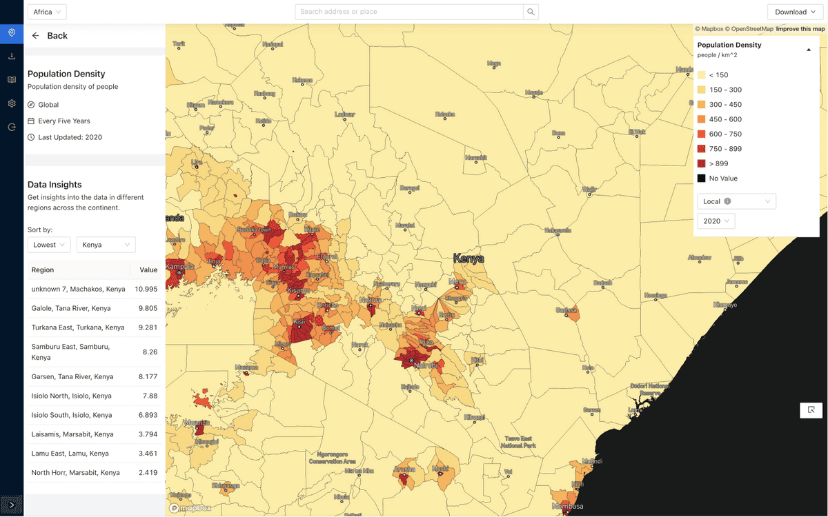
The second goal was to help users explore the data historically & across spatial resolution ( Country, State, District, County, etc.). Helping users understand how a certain variable changed over time in a certain place( eg: How much has average spending grown in the last 5 years).
In initial explorations, the idea was to tie these controls with the visualization layer name card or make them global selectors. Those iterations had one major shortcoming if either of the controls changed. The legend is updated with a different scale of data. At this point, the visual variation of color in choropleth would not convey the appropriate scale. So, the Time & Space controls went alongside the legend.
2. Analysing
Filtering
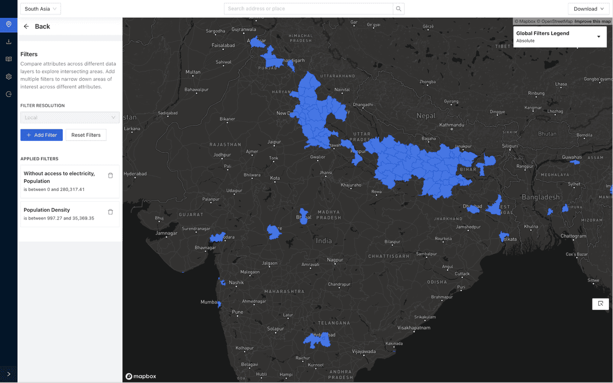
To take meaningful action on geography usually isn’t dependent on a single variable. A combination of variables helps identify target areas that fit a scenario. For eg, If an organization wanted to identify key areas where they could install solar panels for a new electrification project, they might ask, “Where can I find areas with a large population where the spending is at least $1 a day and hasn’t been electrified.”
One of our choices was to keep the visualization a neutral blue color when applying filters. We chose to forgo any color scales when visualizing filters because it helped keep the action distinct from a passive visualization. Secondly, it helped clearly distinguish between filtered areas & selected areas(next section).
Selection & export
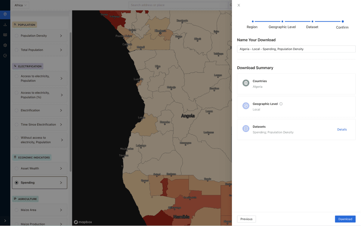
Even with a diverse breadth of data, not all questions can be answered by simply looking at a map or a data table. The end users were academics and researchers who wanted to use our data as a kicking-off point to further work on a problem by combining their data.
They can choose to export information in one of two ways.
- Area selection: Exporting a continental scale dataset seems unproductive when interested in a small section of a country. Thus an area selector was introduced to help select the specific regions to export.
- Custom exporter: While the area selector helped focus on the current data, the custom exporter can help quickly select datasets at different time and space vintages which are helpful for historical analysis.
Results
Multiple organizations have used the platform to explore data with a subscription based model. Over time it has been a successful internal sales tool to garner interest in the underlying data, fostering multiple partnerships.
Some case studies using the platform:
Other highlights
Covid vaccine distribution storymap (frontend dev)
I worked on a scroll-based map interactive (think NYT) case study to highlight further research into the potential distribution of Covid-19 vaccines across the African continent. I worked on data wrangling, design, and front-end development. Featured by Mapbox across multiple platforms.
Check out a quick preview here
Company website
I have been designing and maintaining the company website, created using Webflow alongside the data documentation powered by Mk-docs and have been serving as a content and styling steward for the latter in collaboration with Vivek Sakrani, Head of Applied data science
Fly-to tool
I created a simple internal tool where I did design and front-end dev to help create fly-to videos highlighting our data using the Mapbox API. Here’s a sample of how the result ends up.
More info, questions?
This was the first product we built. There have been multiple prototypes that went in different directions.
Since then, we have been working on our second product using the learnings of the first one. A demand intelligence platform that arms our customers with a deeper understanding of their data and actionable insights to grow their business.
If you any any questions or wanna know more, feel free to reach out.