Helping users find the best flights for their trips
Overview
Kayak is an American online travel agency and metasearch engine that helps travellers across the globe plan their travel by reserving flights, cars, hotels, etc. I worked with the flights pod to work on improving search features.
My role
User research, End-to-End design, prototyping (2019)
Collaborators:
Irene Georgiou, Alkistis Mavroeidi(Design), Anthony Salomone, Luciana Bueno(Product)
Problem
Traveling leisurely & comfortably can mean different things for different users. For some it's finding an late evening flight on friday & early morning flight back on monday. Or for a family it may mean lesser layovers & services provided for childcare by the flights.
This lead to helping future travellers answer 2 questions:
“Which is the best flight for me?”
“When is the right time to buy the tickets?”
Understanding users
To understand how users navigate flight search for different scenarios such as weekend trips, family trips, business trips, etc. I & fellow PM intern Luciana ran user studies.
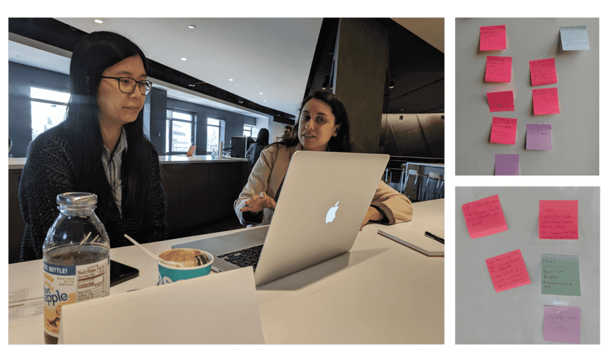
From these user studies we found,
- Final flight selection was a combination of airline, layover, layover duration & price as the most common filters.
- For weekend trips the priorities shifted to right departure and arrival times(leave late on Friday & return early on Monday) & no layovers.
- For more complicated international trips where layovers and airline changes were not optional users failed to recognise these constraints.
First question we helped answer, “Which is the best flight for me?”
1. Travel Hacker
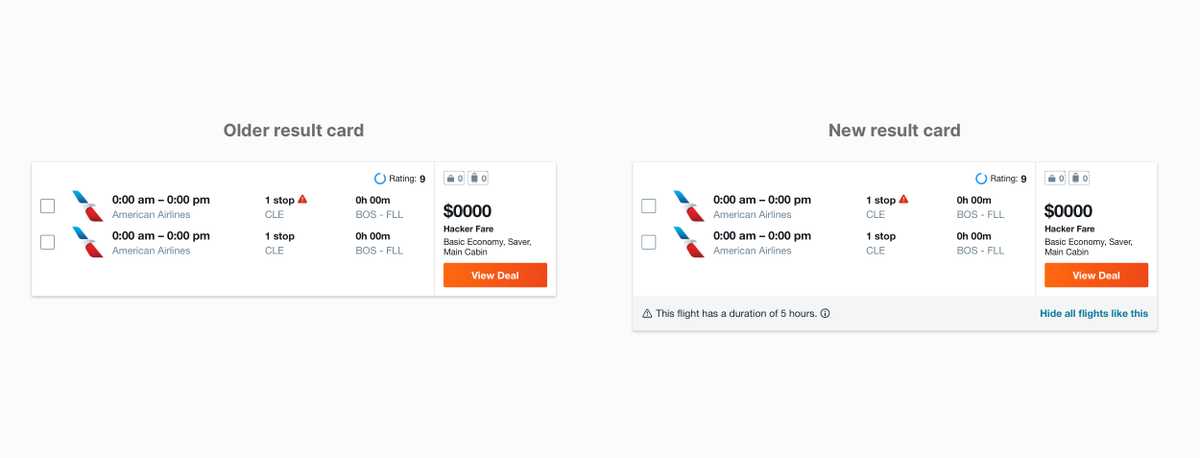
For longer connected flights to slightly less popular airports it’s significantly cheaper to buy tickets with connecting airlines or have airport layover. What does this mean? let’s take a scenario
“A traveller going to San Franciso may save $300 on flight tickets by switching flights between airports in New York. This could mean landing at JFK checking out bags & carrying them on the A-train during rush hour to Laguardia with luggage to get to catch the connecting flight with a different airline within 2 hours.”

The user can save significant money by doing this but it means they have to take the extra effort to change airport with their luggage. This is where context comes to play. A lone traveller may find this as a reasonable offer but for a family with kids this maybe an impossible option.
Design, adding context
Interactions

2. Flight preference personalization
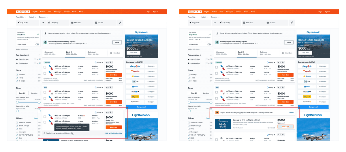
Even though users had different mental models for searching flights for domestic & international travel one preference persisted. Airline preference, avoiding certain airlines. Either due to service or points with other airline partner.
On deselecting airline

Interaction
On filtering out results
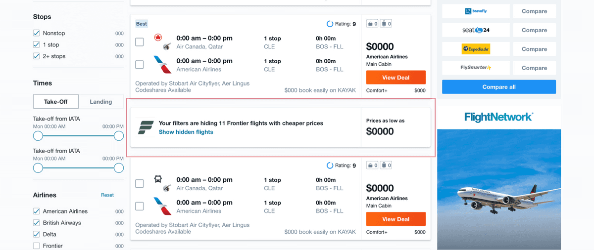

Second question we helped answer, “When is the right time to buy the tickets?”
Flights are a major chunk of expense during a trip. Getting the cheapest & best deals is a huge motivation and the reason why services such as Kayak exist. Flight prices are in a constant flux with variable demand, availability, etc contributing to the price changes.
To address this the flight price predictor was built.
3. Flight price predictor
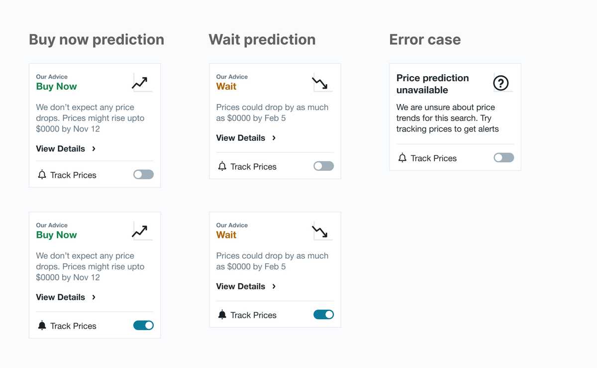
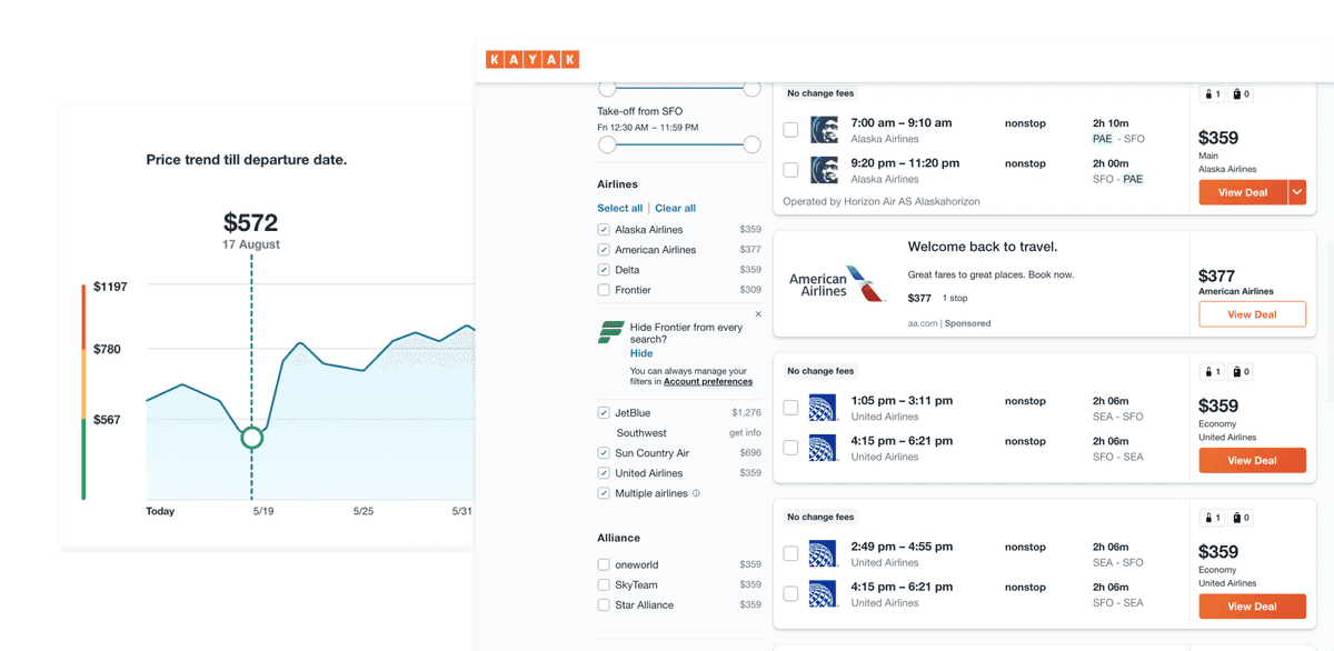
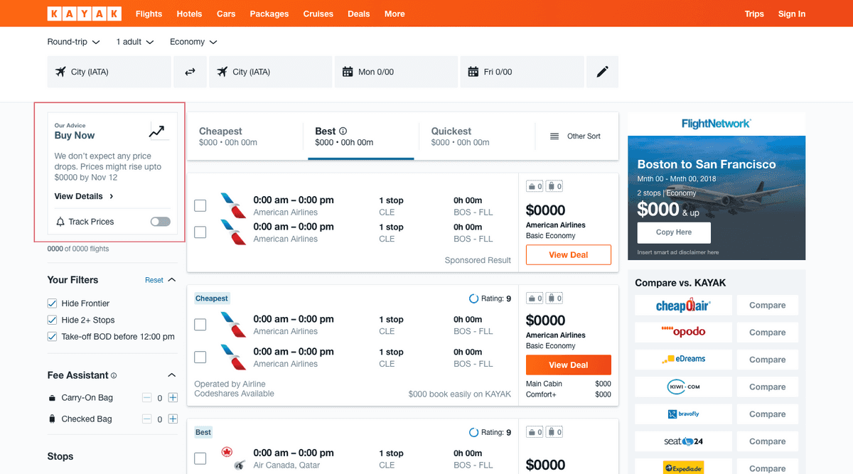
On the flights desktop results page(top left) lives recommendation. It tells the users to “buy” or “wait” to buy tickets based on prices predicted till the departure date.
To add authenticity & give transparency to user why these predictions are being made. A visual indicator was added in the form of a price graph.

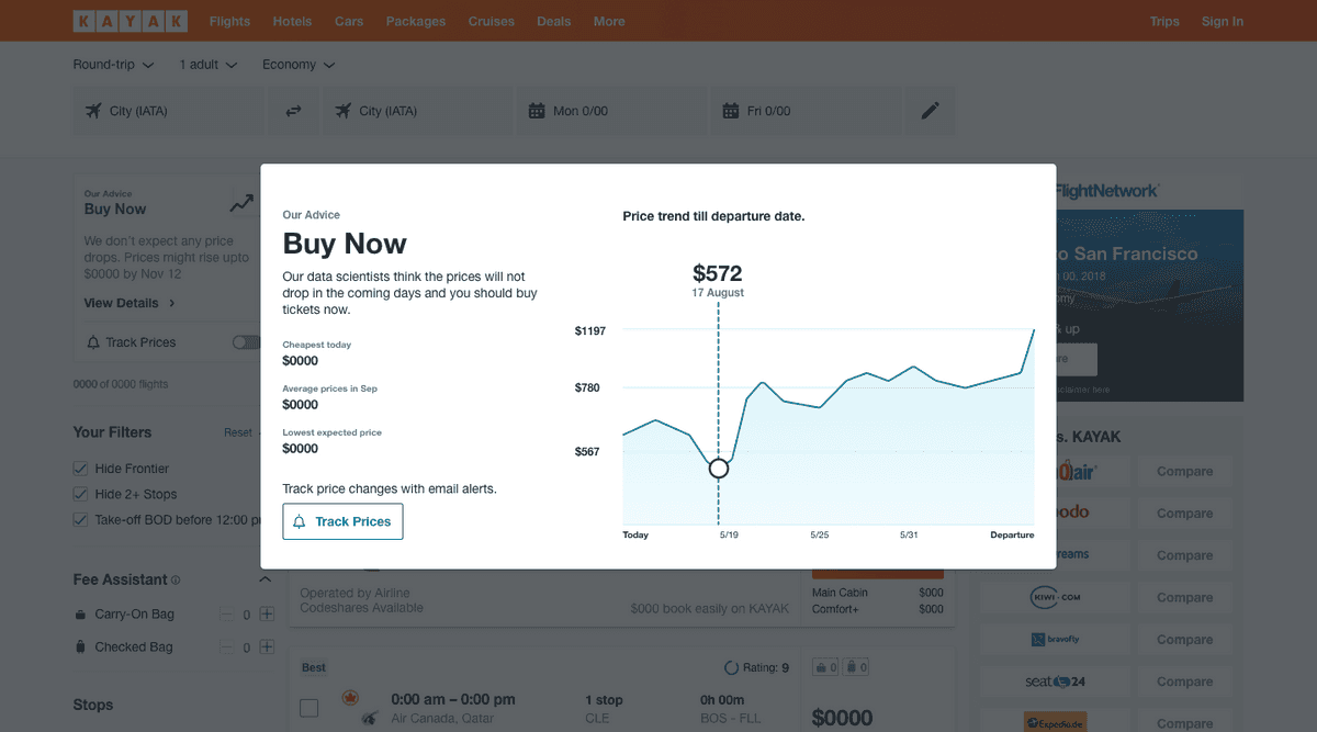
As travel plans are made rarely people are unaware of what the average price of flights to the destinations they are travelling to. The next version of the graph included colors & price ranges to help users identify if they are paying more or less than average prices. Giving them additional information to take a decision.
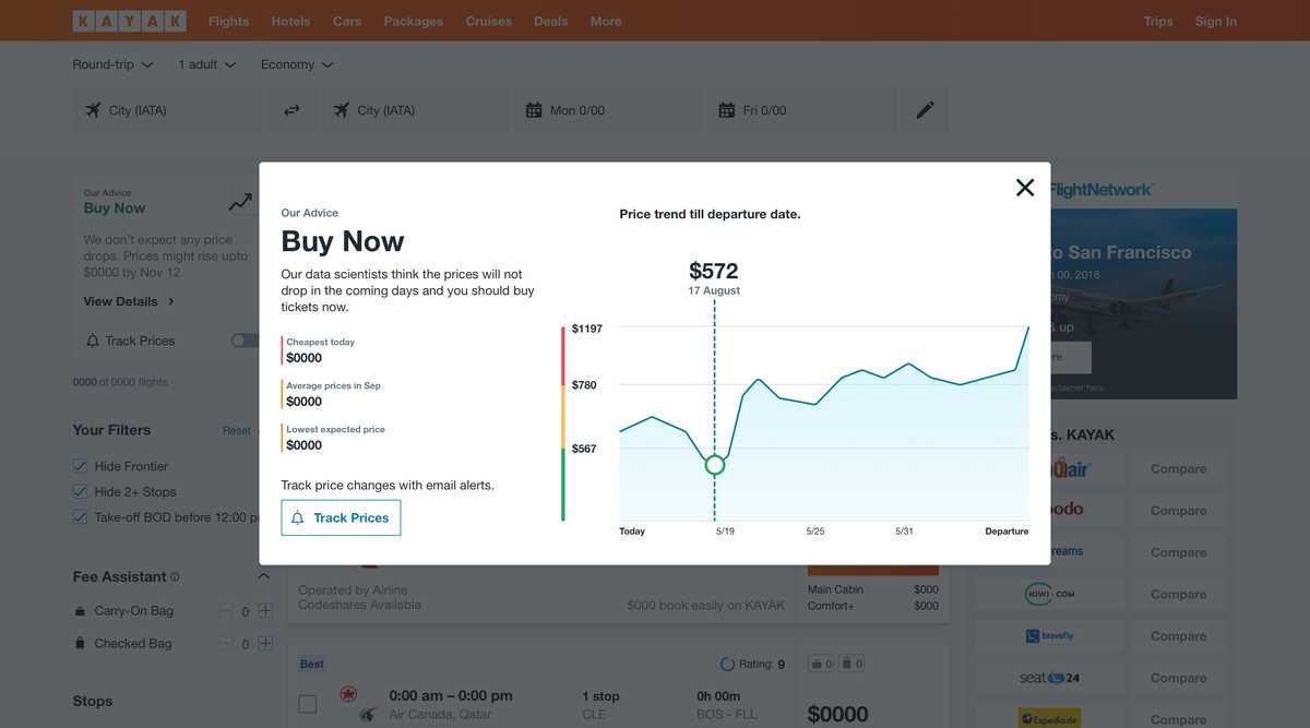
The aim of the feature was to drive users to get email alerts of notifications on their app when the price drops or is at the minimum.
Smaller contributions
I hosted a prototyping workshop while at Kayak where I talked about the aspect of creating more high fidelity prototypes by mixing designs with code & understanding how design systems live as code.
I helped with the micro-animations for a teammates project.